Business Cards
What Makes a Business Card Memorable and Effective?
Discover what makes a business card memorable and effective. Learn how design, typography, color, and personalization can elevate your brand's introduction and ensure lasting connections.
Dec 28, 2025
5 min read
What Makes a Business Card Memorable and Effective?
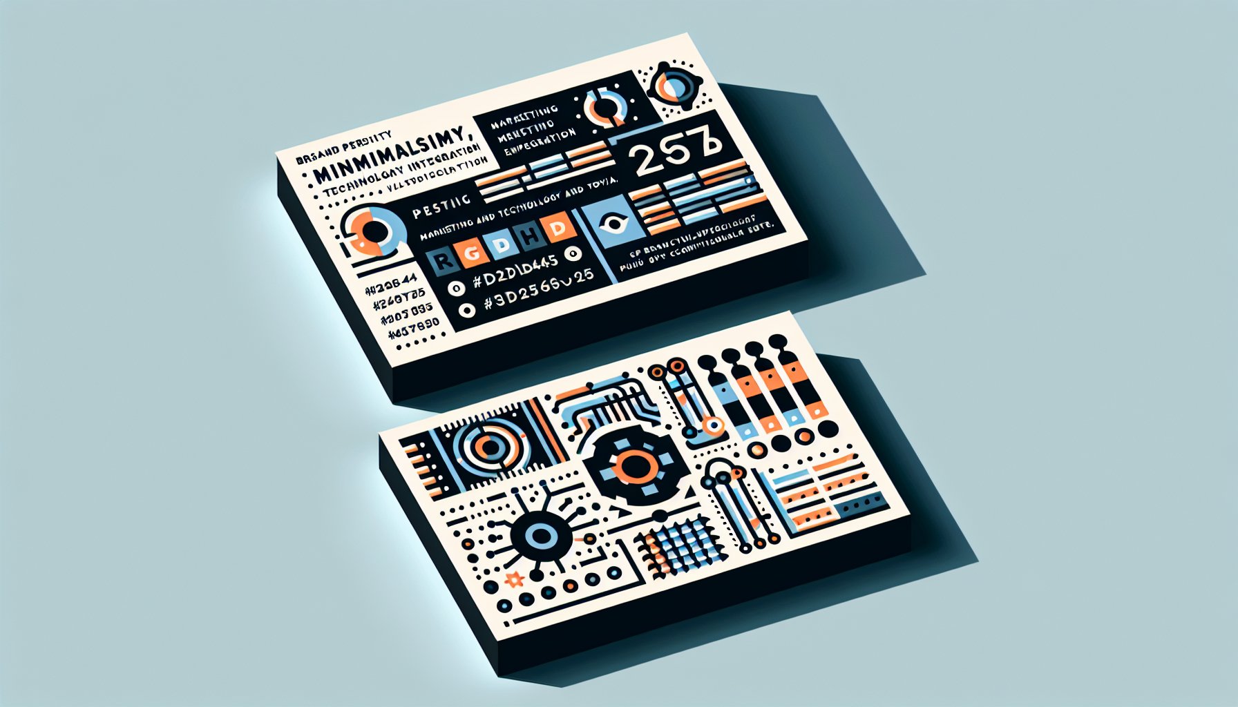
TL;DR: In the world of business, a memorable card is more than just a piece of cardstock. It’s a portable reflection of your brand’s personality, communicating your essence through design, typography, color, and texture. Personalization and minimalism ensure it stands out, while technological integration elevates its utility. It’s not just about being seen; it’s about being remembered and sparking lasting connections.
Beyond the Basics: Crafting Your Brand's Introduction
Ah, the business card! A tiny billboard for your brand, an ambassador that travels in wallets and purses. In the bustling universe of small businesses, where every handshake counts, the humble card isn’t just a relic of bygone days. When designed thoughtfully, it becomes a tangible introduction to your brand, hinting at who you are before words are even spoken.
Start with the basics: ensure your card mirrors your brand's personality. An interior designer who adores modern chic might opt for minimalist layouts and a sophisticated palette, because nothing says "I’ve got style" like a sleek first impression. Meanwhile, if your business vibe screams vibrant, like that of a dog walker or fitness instructor, a card bursting with lively fonts and colors might be your jam. Think of it as setting the stage for a conversation, the perfect icebreaker that gets people talking.
Typography: The Silent Voice of Your Card
Typography isn’t just about picking a pretty font. It’s the voice of your card, whispering, or sometimes shouting, your brand’s vibe. A delicate script exudes elegance, perfect for an etiquette coach, perhaps. But if you’re a creative agency, leaning on quirky fonts could showcase your love for innovation. Remember, readability is your golden rule. Nothing’s more tragic than losing a prospective client because your font size was microscopic.
Texture and Weight: The Feel of a First Impression
When it comes to card weight, consider it the handshake of your introduction, a flimsy card might as well be a limp hand. Invest in substantial, well-crafted materials to signal reliability. A matte finish might shout sophistication, while an embossed logo adds a tactile touch of class. Each choice works together to forge trust and credibility.
The Psychology of Color: Speak to Their Emotions
Colors are emotional ninjas. A serene white card with cool blue text might scream "trust and reliability" (hence why it's a hit with financial institutions). Meanwhile, a splash of vibrant orange can inject enthusiasm, ideal for a marketing agency. But beware: colors carry different meanings across cultures, so know your audience before you paint your brand’s canvas. The right hue can transform your card from a piece of paper into an emotional connector.
The Magic of Minimalism: Less is More
In today’s chaotic world, minimalism cuts through the noise. Imagine a networking event where every card shouts for attention with neon hues and dense text. Then, there’s yours, simple, elegant, and to the point. The beauty of minimalism lies in its clarity, allowing your brand to stand out without shouting. Think of it as a whisper that invites curiosity, encouraging deeper engagement.
The Power of Personalization: Make It Yours
Personalization is like a secret handshake with your client. It shows thought, care, and attention to detail. Consistency with other marketing materials ensures seamless brand recognition. Each design choice, from playful to professional, should invite potential clients into your brand’s world, making your card much more than a mere piece of paper.
Technological Integration: Gateway to a Digital World
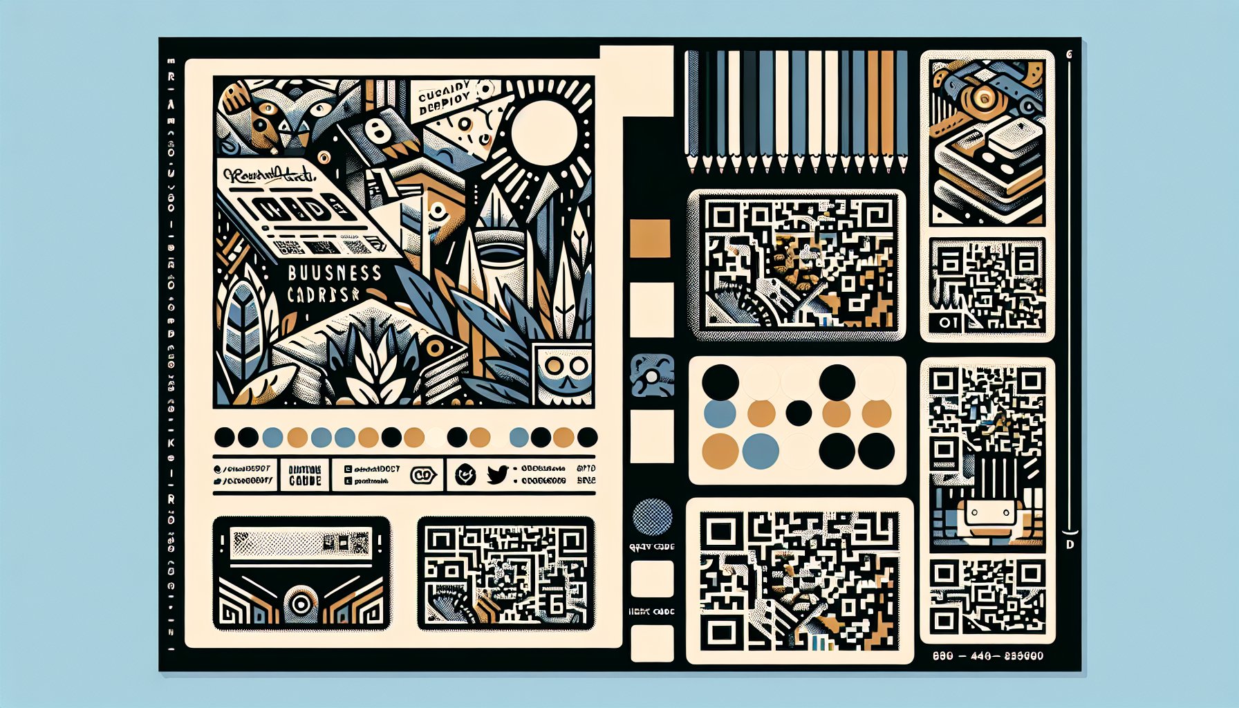
In a digital age, why not let your card straddle both worlds? Enter QR codes, portals to your digital presence, transforming each handoff into a journey of discovery. Imagine augmented reality showcasing your latest project right from your card! Technology, when integrated gracefully, can elevate your card into a memorable experience, bridging the gap between physical and digital interaction.
Case Studies: Lessons from the Pros
Real-world examples? Yes, please! Take Integrated Business Solutions: their textured matte cards, minimalist design, and strategic color use speak volumes about their brand’s sophistication and trustworthiness. Including a QR code that leads potential clients directly to their site effortlessly marries the traditional with the digital, enhancing their networking prowess.
Crafting the Perfect Card: Your Brand in Your Hand
Crafting a standout business card isn’t just about graphic design skills. It’s about self-awareness and brand clarity. Understand your brand's core, choose typography wisely, and render functionality with aesthetics. A consultation with a professional designer can fine-tune these elements into a masterpiece that’s not easily forgotten.
In essence, your business card is your brand's handshake with the world. It’s not just about being seen; it’s about being felt, creating a connection that lasts far beyond that initial exchange. So, embrace the process, and let your card be the key that unlocks your brand’s potential.
Need Help?
Check out these related products that can help:

