
Graphic Design
Understanding the Role of White Space in Graphic Design
Discover the importance of white space in graphic design. Learn how it enhances readability, guides user attention, and elevates brand perception in your designs. Embrace this essential tool for creating impactful, user-centered visuals.
Oct 15, 2025
13 min read
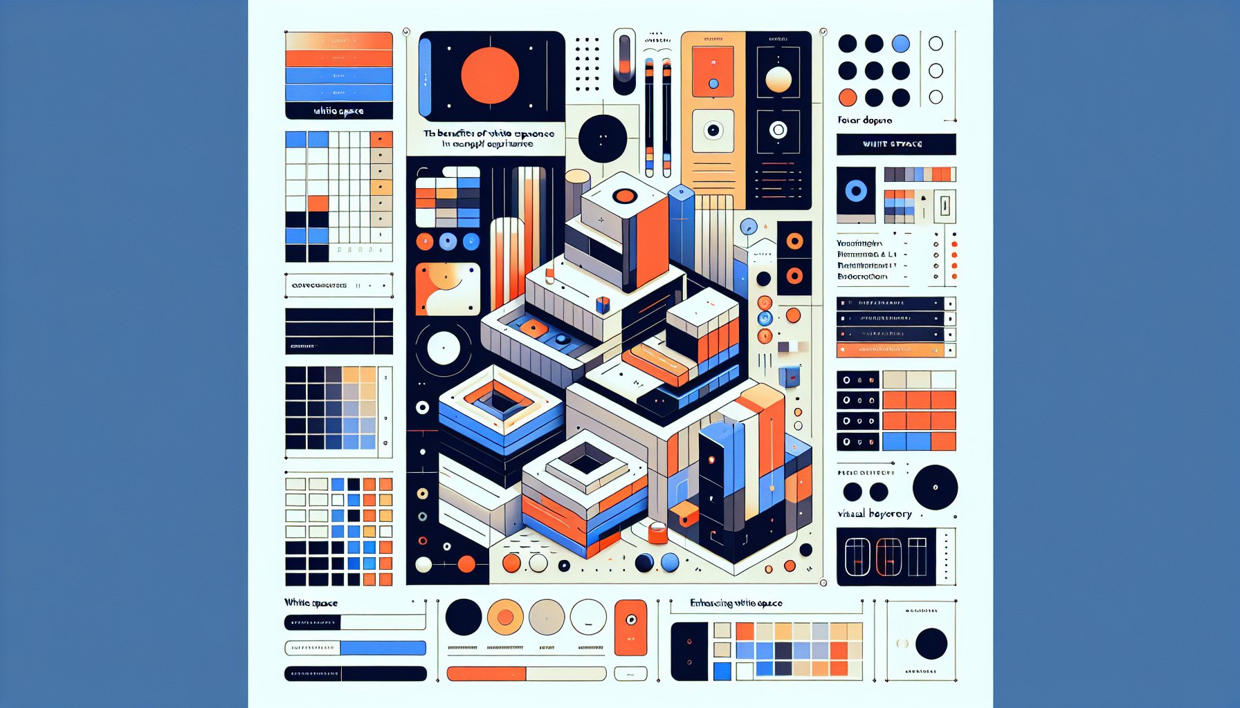
Understanding the Role of White Space in Graphic Design
The Silent Symphony: Unpacking White Space’s Visual Language
In the grand orchestra of graphic design, white space is like the conductor who never shows up in the group photo but somehow manages to run the whole show. Think of it as the pause that makes music dramatic or the deep breath before a big speech. White space, or negative space, is that sneaky silent partner that makes your design sing without needing to say a word.
Imagine landing on a beautifully designed webpage. At first, you might think it's the striking images and bold typography that caught your attention. But look closer, and you'll see the real star of the show: the spaces in between, thoughtfully curated to let information breathe without overwhelming you. In a world where content is king, white space is the serene castle where your mind can rest and explore.
But here's the kicker, white space isn't just about the color white. It can be a whisper of gray, a soft gradient, or even the subtle texture of a background pattern. Its job? To make things readable, legible, and downright digestible. Picture a technical manual for kitchen appliances; the kind no one wants to read but everyone needs. Here, white space is that unsung hero, balancing technical jargon with clarity, making sure you don’t throw the manual (or the appliance) out the window in frustration.
Yet, white space often gets a bad rap, especially from clients who see it as wasted potential. They'd rather fill it with all the bells and whistles. But seasoned designers know the truth, embracing white space means embracing sophistication. Not only does it elevate aesthetic appeal, but it also enhances brand identity, speaking volumes about values like openness and simplicity.
To truly grasp the magic of white space, don’t see it as a void; see it as a presence. It eats chaos for breakfast and spits out clarity. In our distraction-filled digital world, white space asks us to take a moment, slow down, and really connect with what’s in front of us. It’s not just about making a design look pretty, it’s about creating spaces for understanding and connection.
Breathing Room: The Psychological Benefits of White Space
Think of white space as the Zen master of graphic design. It creates a calm oasis in the chaos of visuals, allowing your brain to breathe and focus. According to the cognitive load theory, our minds can only juggle so much information before they start dropping balls. Cluttered designs lead to cognitive overload and frustration. Enter white space, a design’s equivalent of a spa retreat.
Imagine browsing a site crammed with text, images, and buttons vying for your attention. Decision fatigue sets in faster than you can say "CTA overload." On the flip side, designs with ample white space are like a well-planned museum exhibit, guiding your eyes effortlessly to what matters most. This not only improves user experience but also boosts brand trust and engagement.
Take luxury brands like Apple or Chanel, they’re poster children for effective white space usage. Their designs exude sophistication and exclusivity, thanks to lots of breathing room. It's the 'halo effect' in action: when something looks good, we assume it is good. In technical writing, like those pesky kitchen appliance manuals, white space makes troubleshooting steps clear and frustration-free.
Ultimately, white space isn’t just about aesthetics, it’s about cognitive ease. It invites users to pause and engage, rather than skim and scroll. In a world bombarded with visuals, white space is your go-to tool for a meaningful designer-viewer connection. Give your designs the gift of breathing room, and watch the psychological benefits unfold.
Beyond Minimalism: White Space as a Design Philosophy
White space is more than just a pretty face in the design world, it’s a philosophy that transforms how we communicate visually. It's like the quiet pause in conversation that makes the punchline hit harder. White space isn’t about filling the void; it’s about giving each design element a chance to shine.
Take a luxury fashion website, for example. Strategic white space lets users linger on exquisite garment details without sensory overload. This absence of clutter whispers sophistication, pushing the user's focus towards what really matters.
Using white space strategically can transform dense information into accessible content, from user manuals to marketing materials. It’s not just a style choice, it’s a narrative tool that guides user engagement, steering them from passive browsing to active interaction.
White space tells the designer’s audience that what isn’t there is just as important as what is. Brands embracing this philosophy signal modernity, transparency, and a commitment to clarity. Designers, take note, white space isn’t just an element; it’s the secret sauce of effective, emotive design.
Mastering Balance: The Art of Complementary Design Elements
Design is a high-wire act, a constant dance of elements that need their space to perform without stepping on each other's toes. White space, or negative space, is like that small but crucial pause in a dance routine, giving the audience a moment to catch their breath and process the performance.
Picture visiting a website that’s an explosion of images, text, and buttons all clamoring for your attention. While initially eye-catching, the mess quickly becomes maddening. Our brains crave simplicity, and white space steps in as the hero. It gives text generous margins and spaces between images, guiding your eye to the important stuff without the visual chaos.
Luxury brands get this, just look at their websites. The use of white space feels as intentional as a fashion runway, creating an environment of elegance. It’s a storytelling tool that not only highlights products but also amplifies a brand’s values of quality and attention to detail.
White space also sets up visual hierarchy, it's like a backstage pass to the main event, leading viewers to the focal point. A well-placed call to action, cushioned by white space, doesn't just sit there; it beckons you to click, sign-up, or purchase. This is where aesthetics meets function, turning browsers into buyers.
Yet some clients may see white space as untapped potential. The challenge for designers is turning this "waste of space" perception into an appreciation for the art of balance. By educating clients on how white space enhances user experience, designers can create layouts that are not just pretty faces but effective communicators.
Learning from the Giants: Iconic Case Studies in White Space Usage
Feeling lost in the sea of design choices? Let’s take a leaf from the books of some design giants. These big names have turned white space into their secret weapon, proving it’s not just a backdrop, it’s a game-changer.
Take Apple’s logo, for instance. The simplicity of the apple silhouette is amplified by the surrounding white space, turning the logo into more than just branding, it’s a symbol of sleek sophistication and cutting-edge innovation. The space around it is like a spotlight, drawing all eyes to its elegant form.
Then there's Aesop's website, where products are shown against a backdrop of generous white space. This isn’t about aesthetics alone, it’s about enhancing the user experience, inviting you to explore the products calmly and intentionally. This strategy isn’t just about looking good; it’s about creating an engaging narrative around the brand.
Muji, the minimalist furniture brand, uses white space to reflect its ethos of simplicity and functionality. The spacious design lets potential customers appreciate the craftsmanship without distraction. This balance of filled and empty space guides users through the site effortlessly, underscoring Muji's commitment to simplicity.
These examples from design heavyweights teach us that white space is anything but empty space. It’s like the silence in a symphony, an essential component that adds depth and harmony to the whole experience. By studying these icons, budding designers can see how white space transforms ordinary designs into extraordinary narratives.
The Digital Frontier: White Space in the Age of Responsive Design
Welcome to the wild, wild west of digital design, where white space is your trusty sidekick, helping you survive the rough terrain of responsive design. As screens shrink and grow, white space stays constant, ensuring your designs stay legible and engaging.
Imagine a city without any parks, just buildings crammed together like sardines. That’s what dense web designs feel like. White space acts as a digital park, giving users a breather. Platforms like Apple and Airbnb nail this balance, using white space to highlight key features and streamline navigation.
With mobile-first design at the forefront, every pixel counts. White space creates a hierarchy that naturally leads the viewer's eye across varied screen sizes. Picture a minimalist landing page with a striking image and a few words. The surrounding white space amplifies the focus, creating an inviting vibe that encourages interaction.
Yet, not everyone sees the value in leaving space unfilled. Some clients might think they're wasting real estate. Designers, it’s your mission to educate the masses on how white space is the design equivalent of a pause, a strategic tool enhancing readability and engagement.
In the digital age, white space isn't just a pretty face, it's a necessity for effective communication and usability. As designers continue to navigate the evolving digital frontier, mastering the art of white space will set the good apart from the great, ensuring that designs are not only seen but also remembered.
The Business Impact: How White Space Drives User Engagement and Conversion
In a digital world where user attention flits like a hummingbird, white space is your nectar. It's not just the background; it's a secret weapon in the fight for user engagement and conversion. By allowing users to breathe and think, white space can dramatically alter how customers perceive your brand and its offerings.
Imagine a website that’s a minimalist dream, where each section, text or imagery, has its own space. This strategic spacing directs attention exactly where it's needed. Picture a call-to-action button surrounded by generous white space, it’s like a neon sign saying, "Click me!" Effective white space can increase user engagement by as much as 20%.
White space helps establish visual hierarchy, leading users on a journey through your content much like a tour guide. When users encounter less clutter, they're more likely to linger, learn, and, most importantly, convert. A major e-commerce site saw its sales leap by redesigning product pages with more white space, proving that sometimes less truly is more.
Convincing clients of the power of white space might be a challenge, but the payoff is worth it. By educating them on how white space enhances readability and guides user experience, you can turn a skeptic into a believer. In essence, white space is not merely an aesthetic choice, it's a business strategy that enhances user interaction, boosts conversions, and ultimately, drives results.
Common Pitfalls: Navigating White Space Misunderstandings
Ah, the pitfalls of white space misuse, where designers and clients often stumble. Despite its crucial role, white space is frequently seen as wasted space. This misconception can lead to cluttered designs that overwhelm viewers, detracting from the message.
Picture a vibrant homepage bursting with images, text, and graphics, but what feels energetic at first quickly becomes chaotic. Users become overwhelmed, their eyes darting around in confusion. Instead of inviting exploration, the design repels, leading to decreased engagement and higher bounce rates.
Clients, eager to maximize impact, often push back against white space, fearing their designs might appear sparse. But when designers wield white space wisely, it transforms into the silent hero of the composition, enhancing readability and retention.
Misuse also comes from neglecting micro white space, those tiny gaps between letters or lines. Inconsistent spacing can disrupt the reader’s experience, turning even the most compelling content into a chore to read.
The real trick? Educating clients on the true value of white space, showing how it enhances visual hierarchy and user experience. By bridging this understanding gap, designers can craft meaningful designs that resonate and engage.
Future Trends: The Evolution of White Space in Graphic Design
As technology advances and user preferences shift, white space is more than just a design element, it’s becoming a design essential. With minimalism on the rise, white space is poised to play an even bigger role in creating user-friendly designs in an information-saturated world.
Future designers will leverage AI and data analytics to refine the use of white space, optimizing layouts based on user behavior insights. Imagine an AI tool suggesting white space adjustments to improve retention, designers will have the data to back creative decisions that enhance user engagement.
In virtual and augmented reality, white space will evolve beyond two dimensions, enhancing depth perception and user navigation. For inclusive design, white space ensures accessibility, creating clear and legible experiences for all users.
The future of white space isn’t just aesthetic, it's foundational for effective communication and branding. As design evolves, the strategic use of white space will ensure designs are not just beautiful but also functional and meaningful.
Crafting Your Signature: Developing a Personal White Space Aesthetic
When it comes to your signature design style, mastering white space is like discovering the power of silence in music. It’s not about what's missing; it’s about what the absence allows to shine through. Crafting your aesthetic means finding the balance between minimalism and functionality, creating visuals that resonate.
White space isn't just emptiness, it's an ally in conveying your message. A well-designed interface with generous white space lets each element have its moment, guiding viewers to focal points without visual chaos.
Take cues from minimalist brands like Apple, using white space to create elegance and elevate perceived value. Experiment with varying degrees of openness in your compositions, playing with macro and micro white space to establish a visual hierarchy.
Your aesthetic should convey values of transparency and openness. In a fast-paced digital world, designs that embrace white space invite users to pause and engage, transforming passive consumption into meaningful interaction.
Developing your signature white space aesthetic is about harmonizing design elements with the spaces that surround them. By embracing the power of white space, you’re not just creating designs, you’re crafting experiences that inform, inspire, and connect. Let white space be your guide, and watch your creative journey unfold in a crowded digital landscape.
TL;DR
In the world of graphic design, white space is the unsung hero that creates clarity and focus. Far from being just emptiness, it serves as a critical tool that enhances readability, guides user attention, and elevates brand perception. By strategically using white space, designers can transform cluttered layouts into harmonious compositions that boost engagement and conversion. Through education and collaboration, clients can be shown the value of this important design element. As the digital landscape evolves, white space will remain a powerful ally in crafting impactful, user-centered designs.
Need Help?
Check out these related products that can help:
Other Articles You Will Like
Graphic Design
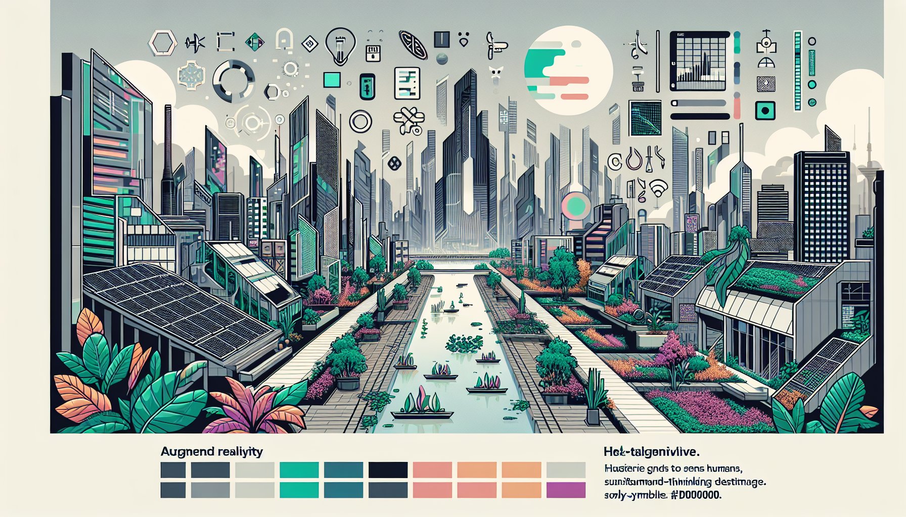
Top 10 Graphic Design Trends to Watch in 2025
Uncover the exciting Top 10 Graphic Design Trends to Watch in 2025, featuring AR/VR innovations, eco-friendly aesthetics, and bold color palettes that redefine creativity. Dive into a world where nostalgia meets cutting-edge design!
Oct 20, 2025
Read More
Graphic Design
Exploring the Role of Graphic Design in Digital Marketing Strategies for 2025
Discover how graphic design is transforming digital marketing strategies for 2025. Explore AI-driven visuals, AR/VR experiences, and sustainable practices that redefine brand storytelling and consumer engagement.
Oct 15, 2025
Read More