
Printed Materials
What Common Mistakes Should You Avoid When Creating Printed Materials?
What common mistakes should you avoid when creating printed materials? Discover essential tips to enhance your designs, from bleed to color choices, ensuring your prints captivate and communicate effectively.
Jan 21, 2026
6 min read
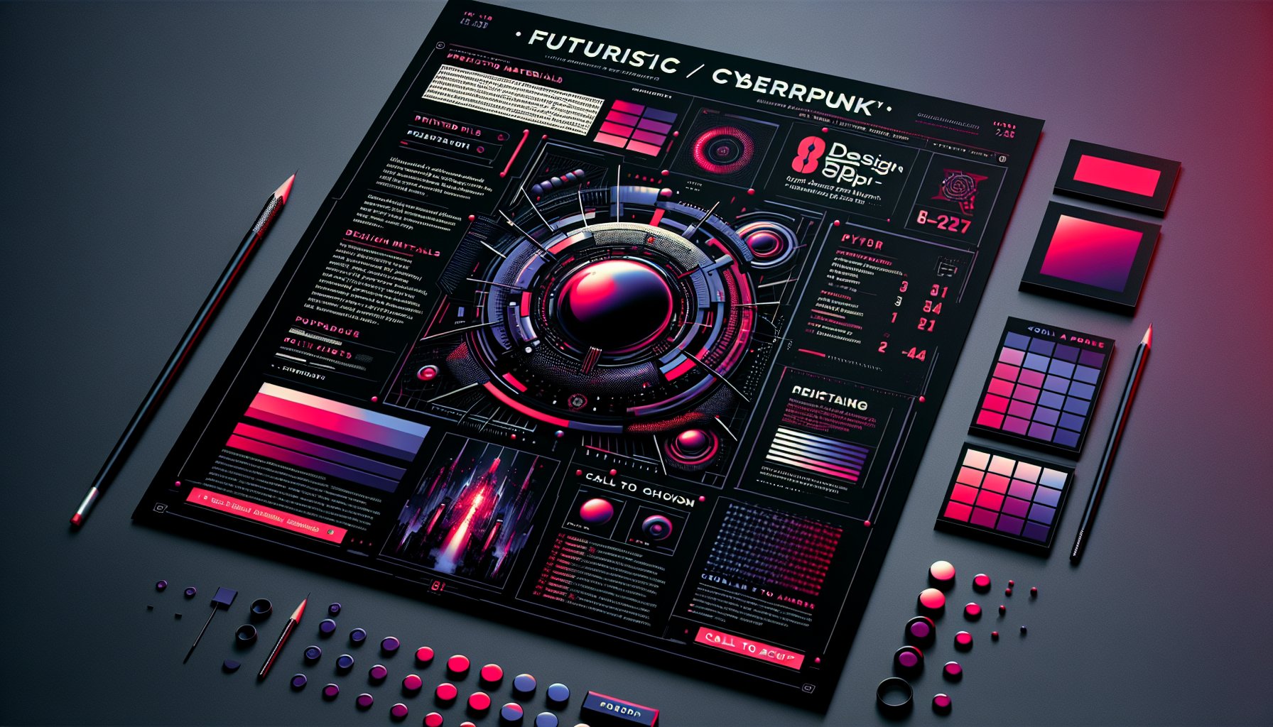
Crafting Print Perfection: Avoiding Common Mistakes in Printed Materials
So, you've decided to embark on the thrilling journey of creating printed materials. Congratulations! You've just opened the door to a world where your brand's identity takes tangible form, a tactile manifestation of your message. But beware, this world is also riddled with potential pitfalls that can turn your vision into a frustrating experience. At Integrated Business Solutions, we get it. With every printed piece, you're not just dealing with ink and paper; you're playing with the very essence of your brand.
Navigating the Nuances
Let's dive right into it. One of the rookie mistakes? Overlooking the “bleed,” which ensures your artwork extends beyond the edges. Think of it as an insurance policy for your design, it saves you from unsightly borders and awkward trims. Pro tip: Allocate at least 3 mm for bleed, and for larger formats, maybe a smidge more.
The Power of the Pen
And then, there's the text. Spelling and grammatical faux pas might seem trivial, but they pack a punch. A typo can scream carelessness louder than a fork scraping a plate. Even seasoned designers fall into this trap, which is why having someone else give the content a once-over is non-negotiable.
Picture Imperfect
Onto images, never underestimate the power of pixels. A picture that looks fantastic on-screen might morph into a pixelated disaster in print. Consulting a printing professional can offer insights into optimal resolutions, ensuring your visuals speak volumes.
The Art of Design
Design is your backbone. It’s the difference between a ho-hum flyer and a head-turner. From typography to color contrast, every element must harmonize. It's not just about aesthetics; it's about crafting an engaging narrative that lingers long after the first glance.
In Conclusion
Getting print right requires a deep dive into the details that can make or break your project. By sidestepping common snares, acknowledging the humble bleed, perfecting your prose, ensuring crystal-clear images, and committing to stellar design, you can print with newfound confidence. After all, your materials deserve to shine, and with a little extra love, they certainly will.
The Visual Vortex: Designing for Eye Appeal
In our digital age, printed materials are like a beautiful vinyl record in a world of MP3s, they just have that extra something. But the path to creating a visual masterpiece is littered with traps. One slip, and you could end up with a bland piece that fails to spark interest.
Eye Candy
Eye appeal is the name of the game. It’s that magnetic pull that captures attention and communicates effectively. Picture walking into a café adorned with well-designed posters versus ones that look like a text bomb exploded, big difference, right? Mess up the design, and your brand image goes down like a lead balloon.
Color Code
And then there's color. Using RGB instead of CMYK? Rookie mistake! RGB is for screens; CMYK is for print. Misstep here, and your vibrant design could end up looking like it’s been left out in the rain.
Typographic Tangles
Typography also deserves a shout-out. Overloading with fonts? You might as well hand out sunglasses for free. Instead, use two or three complementary fonts to guide the reader's eye.
Font Follies: The Typography Tightrope
Typography isn’t just decorative; it’s the invisible thread that weaves your visual and textual elements together. Get it right, and you’re a legend. Get it wrong, and, well, you’re stepping into chaos.
Taming the Typeface
Picture a sleek business card with a stunning logo marred by an unreadable font. It’s tempting to go for decorative fonts, but remember, communication is key. Keep it legible and let the typography enhance, not hinder.
Hierarchy Harmony
Don’t underestimate the font hierarchy, either. It’s like giving directions: clear and organized. Otherwise, your design could end up like a confusing road map leading nowhere.
The Content Conundrum: Balancing Brevity and Substance
Creating printed materials is like composing a symphony, all elements must harmonize. The toughest note to hit? Balancing brevity with substance. Cut too much, and you risk leaving your audience lost and uninspired.
Words that Speak
Take a local coffee shop promoting new brews. A tagline that says, “Try our new coffees!” might catch an eye, but it’s the rich story behind each brew that seals the deal. Substance matters, don’t skimp on it.
Color Chemistry: The Science of Color Choices
Colors aren’t just about looking pretty; they wield psychological power. Understanding color chemistry can elevate your print from mundane to memorable.
Hue Know It
Use reds and oranges to energize; blues and greens to soothe. But remember, the print process (CMYK) is different from digital (RGB). Proper conversion is crucial to avoid dull surprises.
The Contact Card Catastrophe
Business cards are your brand’s ambassadors. Yet, the missing link often lies in the call to action (CTA). Without a compelling CTA, your card’s impact fizzles out like a dud firecracker.
Call to Action
A strong CTA bridges curiosity and action. Make it bold, make it clear, and place it where it can’t be missed. A well-designed CTA turns a mere card exchange into a budding relationship.
Media Mix-Up: Choosing the Right Paper and Finish
Paper choice is more than a detail; it’s your brand’s handshake. Opt for luxurious paper for high-end pieces and balance quality with budget for casual prints. It’s about aligning the physical feel with your brand’s ethos.
Finishing Touch
A glossy finish could make colors pop, whereas matte minimizes glare for text-heavy documents. The wrong choice can send mixed signals, undermining your effort.
Proofing Perils: The Last Line of Defense
Proofing is your final stand before a design goes to print. Overlook it, and even a small error can haunt you. Double-check everything, spelling, images, bleed. The devil is in the details.
Timing Tactics: The Art of Strategic Timing
Timing isn’t just about deadlines; it’s about aligning your print materials with market trends and customer behavior. A rushed print job often leads to mistakes, strategic timing is everything.
Distribution Dilemmas: Navigating the Delivery Landscape
Distribution is the final hurdle. It’s not just about getting materials to the right place, it’s about getting them there, when they matter most, undamaged, and right on cue.
The Future of Print: Innovations and Insights
In a digital world, print remains a steadfast medium. Tech advances like augmented reality and sustainable practices are breathing new life into traditional print, making it more engaging than ever.
By embracing these insights, both timeless and fresh, your printed materials game will not only meet expectations but surpass them in the most delightful ways. Happy printing!
TL;DR:
Creating printed materials is an art. Avoid common pitfalls like ignoring bleed, using low-res images, or rushing the timing. Master the nuances of design, typography, content balance, color choice, and strategic distribution. Add a modern twist with tech advances like augmented reality. Print smart, and watch your brand soar.
Need Help?
Check out these related products that can help:
Other Articles You Will Like

Printed Materials
The Role of Printed Materials in Building a Memorable Brand Identity
Discover how printed materials play a crucial role in building a memorable brand identity. Explore the synergy between print and digital, and learn why quality print can elevate your brand's presence and customer engagement.
Mar 12, 2026
Read More
Printed Materials
Navigating the Digital Shift: Printed Materials in 2025 and Beyond
Discover how printed materials are evolving in 2025 amidst digital transformation and sustainability demands. Learn about personalized packaging, hybrid models, and the enduring impact of print in a digital-first world.
Mar 11, 2026
Read More

Printed Materials
Top Trends in Printed Materials You Need to Know for Effective Branding
Explore the top trends in printed materials that are transforming branding strategies. From interactive designs to sustainable practices, learn how to captivate your audience with innovative print marketing techniques.
Mar 11, 2026
Read More

Printed Materials
6 Eco-Friendly Printed Materials to Use in Your 2025 Marketing Efforts
Explore innovative eco-friendly printed materials to elevate your 2025 marketing efforts. From sustainable inks to recycled media, learn how to engage consumers while promoting a greener future.
Mar 10, 2026
Read More

Printed Materials
The Future of Printed Materials: Trends and Innovations for 2025
Discover how printed materials are evolving in 2025 with trends like eco-friendly inks, hyper-personalization, and augmented reality. Explore the exciting innovations reshaping the print industry and its sustainable future.
Mar 10, 2026
Read More
Printed Materials
How to Measure the Success of Your Printed Materials?
Discover essential metrics to evaluate the success of your printed materials. Learn how to leverage response rates, conversion metrics, and technology integration to enhance your print campaigns and drive brand loyalty.
Mar 09, 2026
Read More
Printed Materials
The Ultimate Guide to Sustainable Printed Materials for Eco-Conscious Businesses
Discover how to transform your business with sustainable printed materials. Explore eco-friendly options like bamboo and seed paper, and learn how to align your brand with environmental values in 'The Ultimate Guide to Sustainable Printed Materials for Eco-Conscious Businesses'.
Mar 09, 2026
Read More