
Graphic Design
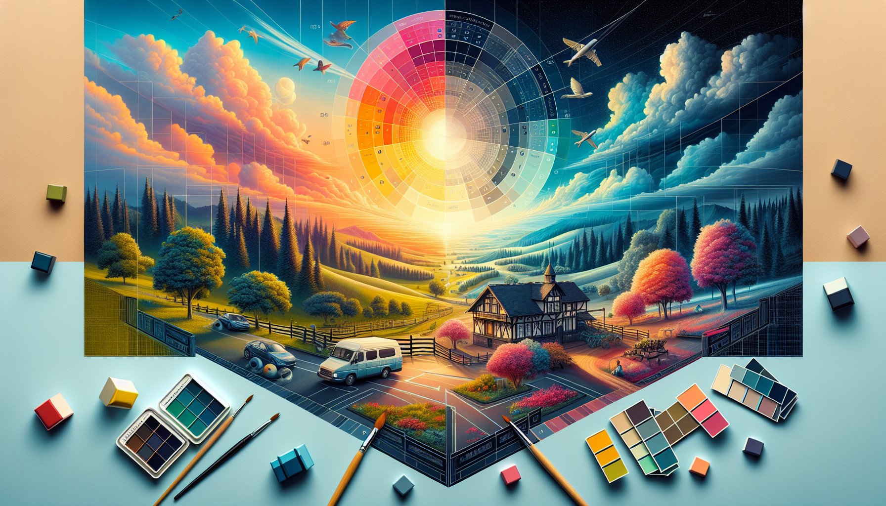
Essential Graphic Design Principles Every Beginner Should Know
Unlock the secrets of graphic design with essential principles every beginner should know. From visual perception to color theory, learn how to create stunning designs that resonate and engage your audience effectively.
Oct 21, 2025
6 min read
Essential Graphic Design Principles Every Beginner Should Know
Let's embark on this delightful journey through the foundational principles of graphic design, where we'll unearth the secrets to crafting visually arresting and effective designs. Picture this: you’re the budding Picasso of pixels, wielding your digital brush to create art that not only wows but speaks. Let's dive into the essentials every newbie should master to make that happen.
1. The Eye of the Beholder: Understanding Visual Perception
Ah, the magical realm of visual perception! It's like the Hogwarts of graphic design where each stroke of color and each shadowy shape can alter what a viewer sees and feels. Think of it as a complex cocktail of light, culture, and experience shaken (not stirred) by our brains. Imagine a marketing campaign for a luxury resort, you can conjure serenity with soft, gentle hues, or stir excitement with bold, angular designs. Different cultures might sip a color differently: white is pure bliss in some, a shade of mourning in others. Remember, understanding your audience’s cultural context can transform your design into a universal story that speaks volumes.
2. Harmony in Chaos: The Power of Balance
Balance in design is like yoga for your visual elements, tranquility amidst potential chaos. It's about distributing visual weight to keep things from toppling over into an aesthetic mess. Picture a serene landscape painting; now channel that mental zen into your layouts. Symmetrical balance is your go-to for that professional vibe, think of the neatness of a bank's website with perfectly aligned images. Want to mix things up? Asymmetrical balance adds a dynamic twist, making your design pop with a touch of controlled chaos. Embrace the balance, young grasshopper, and your designs will not only invite but delight the eye.
3. Color Me Confident
Enter the kaleidoscope of emotions! Color is the unsung bard of graphic design, whispering feelings where words fall short. Red screams urgency, while blue whispers trust; brands harness these hues like spells to guide your emotions. Crafting a mental health campaign? Blues and greens will lull you into calm, while stark black-and-white imagery grounds you in reality. Be mindful of cultural interpretations, a little cultural faux pas and your design might scream a message you never intended. Master this colorful language, and your designs will resonate like a Beethoven symphony.
4. Typography: The Unsung Hero of Design
Typography might sound like it's about choosing fonts, but it’s like picking the right outfit for a first date. It sets the mood and communicates volumes before a word is read. A serif typeface whispers elegance, while a playful script font shouts casual fun. Typography guides eyes, screams importance, or whispers details, it's all about that visual hierarchy. Refine your typeface selection to no more than three, and watch as even the most fleeting glance absorbs your intended message like a sponge.
5. The Grid of Life
Think of grids as the unsung backbones of your design: the silent heroes ensuring everything falls into place. They offer structure, consistency, and, yes, a little breathing room for your creative chaos. Picture Swiss design's clean lines and harmony, grids can help you achieve that effortless balance. Use them to align content, maintain consistency across platforms, and foster trust with a cohesive brand identity. Remember, grids are your creative Swiss army knife, utilize them wisely and your designs will sing.
6. Whitespace: The Breath of Design
Whitespace, or negative space, is the sweet silence between the notes in a great symphony. It’s the breathing room your designs need to be seen and not just glanced at. Think of a gallery art piece swamped by clutter versus one framed against a simple white wall, it's the difference between chaos and clarity. In web design, whitespace not only enhances readability but also gently nudges users’ eyes toward key points. Use it to create calm, focus, and elegance, because sometimes, what isn’t there is just as powerful as what is.
7. Consistency is Key: Creating Visual Cohesion
Consistency is like the secret sauce for brand recognition. Just like you know the Apple logo when you see it, your designs should echo a tune that becomes an earworm in your audience’s mind. A cohesive color palette, typography, and layout aren't just aesthetics, they're the storytellers of your brand's identity. Sticking to a visual script allows you to create powerful, lasting connections with your audience, ensuring your message isn't just understood but remembered.
8. The Narrative Thread
Your designs aren’t just static art; they’re engaging narratives that draw viewers into a visual novel. Imagine an ad for a café that weaves tales of rich aroma and community warmth, your design becomes the storyteller. Each color, font, and graphic should serve the narrative thread, stitching together a cohesive and emotional storyline. Just like Airbnb’s narrative of belonging, your designs have the power to invite your audience into a journey they won’t forget.
9. Design for All
Inclusivity isn’t just a buzzword; it's the heart and soul of modern design. Ensuring your designs are accessible means opening your visual world to all, regardless of ability. From color choices to accommodating screen readers, your designs should be as welcoming as a friendly smile. Think of the broader audience, those with visual impairments or cognitive challenges, and design with empathy and inclusivity. In this diverse world, design that speaks to everyone is not just kind but smart business.
10. From Theory to Practice: Your First Design Project
So you’ve absorbed these principles like a sponge; now it’s time to squeeze out your first masterpiece. Approach your inaugural project, say, a community event poster, with an artist’s heart and a scientist’s mind. Consider your colors, balance your elements, and create a hierarchy that leads the eye effortlessly. Practice with design software, seek feedback, and iterate. Transform your theoretical knowledge into a practical showcase of your burgeoning skillset, and soon, you'll be mastering the art of making designs that linger long in minds and hearts.
TLDR
Begin your graphic design journey by mastering visual perception, balance, color theory, typography, grids, whitespace, and consistency. Craft narratives that resonate, ensure inclusivity, and practice these principles in real-world projects. Remember, design isn’t just seen; it's felt, a universal language transcending the confines of words.
Need Help?
Check out these related products that can help:
Other Articles You Will Like
Graphic Design
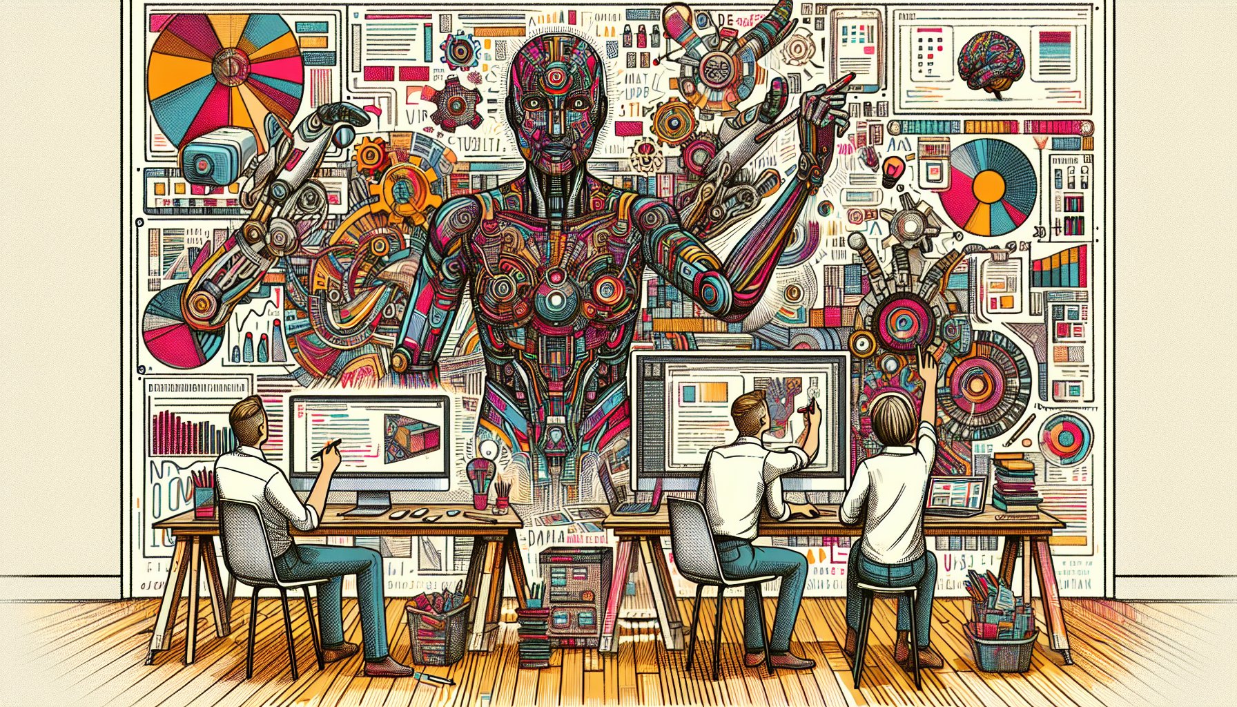
The Impact of AI on Graphic Design: What to Expect in 2025
Discover how AI is set to revolutionize graphic design by 2025. From enhancing creativity to democratizing design, explore the transformative impact and what it means for designers in the evolving landscape.
Oct 23, 2025
Read More
Graphic Design
The Evolution of Logo Design: Trends and Tools for 2025
Explore the evolution of logo design as we approach 2025. Discover the latest trends, tools, and cultural considerations shaping the future of branding. Stay ahead with insights on minimalism, maximalism, and the impact of AI in logo creation.
Oct 22, 2025
Read More
Graphic Design
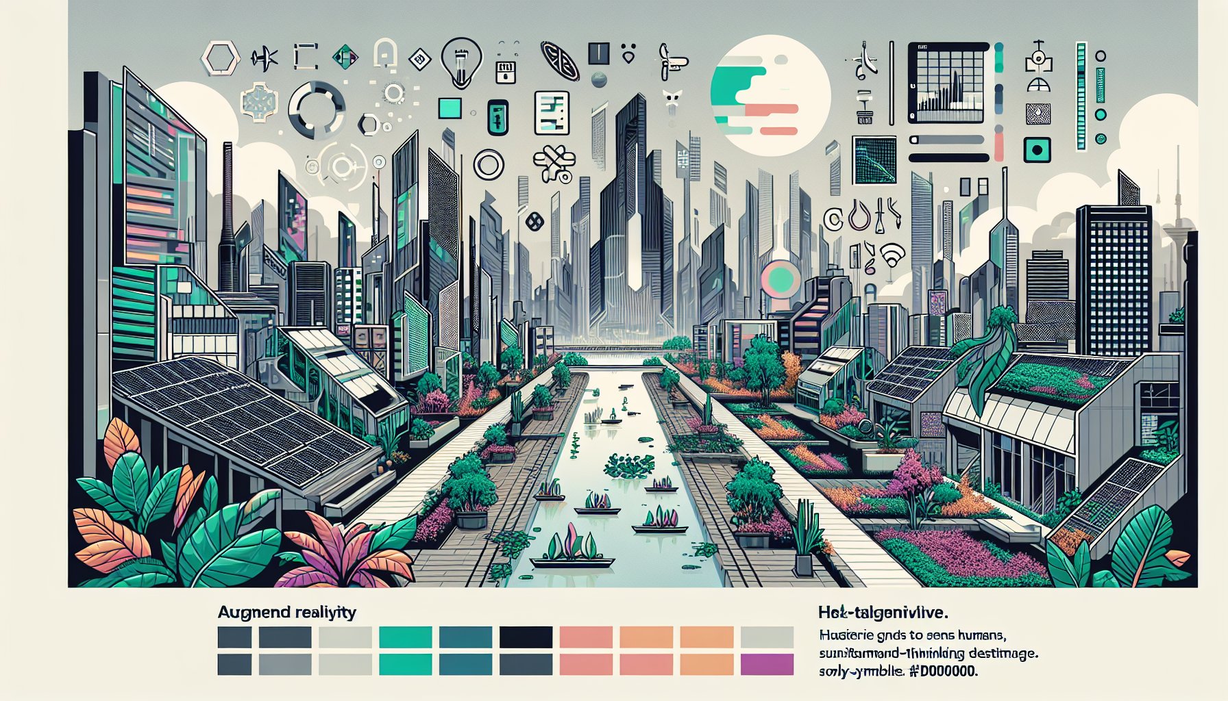
Top 10 Graphic Design Trends to Watch in 2025
Uncover the exciting Top 10 Graphic Design Trends to Watch in 2025, featuring AR/VR innovations, eco-friendly aesthetics, and bold color palettes that redefine creativity. Dive into a world where nostalgia meets cutting-edge design!
Oct 20, 2025
Read More
Graphic Design
Understanding the Role of White Space in Graphic Design
Discover the importance of white space in graphic design. Learn how it enhances readability, guides user attention, and elevates brand perception in your designs. Embrace this essential tool for creating impactful, user-centered visuals.
Oct 15, 2025
Read More
Graphic Design
Exploring the Role of Graphic Design in Digital Marketing Strategies for 2025
Discover how graphic design is transforming digital marketing strategies for 2025. Explore AI-driven visuals, AR/VR experiences, and sustainable practices that redefine brand storytelling and consumer engagement.
Oct 15, 2025
Read More