Logo Design
7 Essential Tips for Creating a Memorable Logo Design
Unlock the secrets to impactful branding with these 7 essential tips for creating a memorable logo design. Discover how simplicity, color psychology, and strategic symbolism can elevate your brand identity and resonate with your audience.
Dec 01, 2025
12 min read

TL;DR
Creating a memorable logo is an art that melds simplicity, emotional resonance, and strategic foresight. By focusing on branding beyond aesthetics, understanding the psychology of color, and carefully selecting typography, businesses can craft logos that stand the test of time. Harnessing iconic symbolism, ensuring versatility, and engaging in feedback loops are crucial steps in this journey. Designing for impact and future-proofing will ensure that your logo not only represents your brand today but remains relevant in the years to come. Integrated Business Solutions' rebranding effort is a testament to the power of a thoughtful logo in building trust and recognition.
Branding Beyond the Mark: The Essence of a Logo
We live in an era where a logo is often the first handshake between your brand and the world. But let’s dive deeper, it's not just about looking pretty. A logo mirrors the soul of a brand, embodying core values, missions, and visions and speaking volumes without uttering a single word. Take Integrated Business Solutions, for instance; here, the logo isn't just a quirky symbol. It's a strategic powerhouse that builds trust, fosters emotional ties, and sets them apart from the sea of competitors. This metaphorical business card without words speaks about what the company stands for with its design elements.
Consider Airbnb's logo story. The "Bélo" wasn’t just a glorified ‘A’; it screamed belonging and community, capturing what Airbnb is all about. With that simple design, Airbnb created a universal community symbol, showing just how powerful a logo can be when it embodies a brand's essence.
Deep introspection is critical. What does your brand want to evoke? For Integrated Business Solutions, perhaps it’s professionalism and innovation. Here, color, shape, and typography are your best pals. Blue can whisper trust and reliability, while sleek fonts scream innovation. But it’s not just about looks, your logo needs to work on every canvas. Whether it’s a business card or a billboard, it should maintain its charm. Think of Nike’s swoosh, a symbol holding its own across any platform. That’s logo magic.
In essence, a logo transcends visual appeal. It's a vital ID card that communicates your brand’s ethos. By keeping it simple yet emotionally resonant and adaptable, brands like Integrated Business Solutions can create a logo that doesn’t just look good but acts as a strategic ambassador in the crowded market. It’s about building a lasting brand experience that empowers growth.
The Psychology of Color: More Than Meets the Eye
Color, it's not just eye candy. It’s the unsung hero in logo design, often wielding more power than we give it credit for. Color can stir emotions, send messages, and shape perceptions, it’s practically brand telepathy. For Integrated Business Solutions, understanding color psychology is key to creating logos that not only pop but connect deeply with their audience.
Take Coca-Cola’s fiery red, for example. It’s not just a color; it’s an invitation to excitement and energy, aligning perfectly with the brand’s vibrant nature. Over at IBM, blue sings a different tune, one of trust and dependability, a perfect match for a tech behemoth. Our responses to colors are no accident. They're steeped in cultural, experiential, and even biological roots.
For Integrated Business Solutions, the choice of green or blue in the logo could speak to trust and innovation. Studies show that a whopping 90% of snap judgments about products are based on color alone, proof that a thoughtful color scheme can shape how your brand is perceived.
Armed with this knowledge, Integrated Business Solutions should tap into strategic color choices. Engage focus groups, conduct surveys, and experiment with shades. Your logo will not just catch the eye; it’ll make a lasting impression.
Typography as Identity
In the logo game, fonts are like choosing the right voice for a conversation. They can make or break your brand’s identity. A single font choice can evoke emotions, shape perceptions, and guide a brand’s trajectory. For Integrated Business Solutions, picking the perfect typography is as crucial as selecting a brand voice.
Think of Google and Apple with their bold, sans-serif fonts. They ooze modernity and accessibility. Meanwhile, traditional serif fonts might suit a bank better, exuding reliability and trust. For Integrated Business Solutions, audience matters. A contemporary sans-serif could resonate with startups seeking innovative solutions, perfect for today’s digital-first world.
But it's not just about aesthetics. Letter spacing, weight, and curvature can drastically tweak perceptions. A rounded font feels approachable, while sharp edges bring sophistication. It's these nuances that enable Integrated Business Solutions to craft a distinctive identity.
Remember, your logo needs to work wherever it lands, from business cards to digital devices. Brands like FedEx have nailed this, with sleek designs easily recognizable at any size. Integrated Business Solutions should ensure its typography adapts seamlessly across mediums, maintaining brand cohesion.
Understanding typography’s role in logo design helps create a font choice that resonates with your target demographic. Typography isn't just about letters; it’s about crafting a brand identity that speaks loud and clear, forging connections with your audience. In a world of choices, an intentional typeface can become your brand’s guiding light.
Simplicity is Key: The Power of Minimalist Design
In a branding world teeming with complexity, simplicity emerges as the guiding star of logo design. Iconic logos often share one trait: minimalism. This design philosophy champions clarity, capturing a company’s essence in recognizable elements. For Integrated Business Solutions, embracing minimalist design is crucial, attracting customers and instilling trust.
Apple’s logo is a case in point. The bitten apple is more than aesthetics; it embodies innovation and sophistication. Its power lies in its quick emotional and associative evocation. Complex logos can alienate rather than invite. Apple's simplicity transcends language and cultural barriers, effective minimalist design at its best.
When crafting a logo, strip away excess to reveal the brand's essence. For Integrated Business Solutions, clarity and professionalism can be conveyed through geometric shapes and a limited color palette. This doesn’t stifle creativity; it challenges you to use minimal elements to tell a rich story.
Moreover, simplicity enhances versatility. A logo should excel across mediums, from business cards to websites. Complex designs distort or lose impact when resized, whereas minimalist logos retain their integrity. Picture your logo on a billboard and a social media avatar; simplicity ensures clarity and impact in both cases.
Ultimately, minimalist design isn’t just about visuals; it forges emotional bonds. A logo designed with simplicity resonates deeply, building trust. Integrated Business Solutions can leverage this to create memorable logos encapsulating their mission, standing out in a crowded marketplace. Embracing simplicity is a strategic move that lays the foundation for a brand’s lasting identity.
Iconic Symbolism
In logo design, "iconic symbolism" is more than art; it’s a bridge between a brand and its audience. A well-crafted logo embodies a company's mission and values. For Integrated Business Solutions, meaningful imagery is not optional, it’s vital. The right symbolism builds trust, recognition, and shared stories with the brand.
Take Apple. The apple silhouette with a bite isn’t just a design; it’s rich with meaning. The bite symbolizes knowledge, innovation, and understanding, resonating with consumers who view Apple as a creativity pioneer. Integrated Business Solutions can use symbolism reflecting empowerment, perhaps an abstraction of growth like upward arrows, evoking aspiration.
Crafting meaningful imagery requires aligning symbols with company values. For Integrated Business Solutions, focus on reliability and guidance. Colors, shapes, and typography should reinforce these traits. Blue conveys trust, green symbolizes growth, and a bold font suggests professionalism. Thoughtfully selected elements ensure your logo is a visual shorthand for company promises.
Moreover, symbols with stories deepen connections. When clients learn the meaning behind design choices, they relate personally. This emotional resonance drives loyalty, turning acquaintances into advocates.
"Iconic symbolism" captures complex narratives in a single image. For Integrated Business Solutions, the challenge is crafting visually appealing logos embedded with mission-reflecting meaning. Symbolism isn’t decorative; it connects brands with audiences, making logos memorable and meaningful.
Versatility and Scalability in Logo Design
In today's dynamic business world, a logo must be more than a static representation. For Integrated Business Solutions, a logo’s versatility and scalability aren't just desirable; they're survival essentials. A logo must adapt seamlessly across platforms and mediums, embodying brand essence without losing impact.
Consider Airbnb. Its logo, a stylized "A," resonates across contexts, from apps to signage, conveying belonging and community. Likewise, Nike’s swoosh shows extraordinary adaptability, transcending language. The logo’s simplicity allows recognition, whether on mini-tags or stadium displays.
Versatility means embracing simplicity to avoid complex element issues. McDonald's golden arches exemplify this. Simplicity ensures recognition, whether on apps or restaurant signs. For Integrated Business Solutions, test the logo in various sizes and formats to ensure appeal on mobile and event banners.
Scalability means evolving logos with growing brands. FedEx’s branding evolution exemplifies this, streamlining from complex to efficient for global expansion. Scalability ensures logos adapt to new services or markets without redesigns.
For business impact, logos must embody versatility and scalability. Embracing these qualities creates lasting icons, ensuring brand representativeness and evolution in a rapidly changing world.
Feedback Loops: The Art of Refining Your Design
In logo design, the initial idea is just the starting point. Creation is step one; success lies in continuous feedback and refinement. Feedback loops are powerful tools, mechanisms for insights, adjustments, and elevating the final product to truly embody your brand.
Imagine Integrated Business Solutions, eager to unveil a logo reflecting efficiency and innovation. Initial enthusiasm meets diverse feedback. Some see confusion; others suggest energy-mismatched colors. Embracing this feedback, the team gains perspectives for stronger design.
This iterative process, gathering feedback, tweaking designs, and revisiting stakeholders, is the backbone of effective feedback loops. Integrated Business Solutions might conduct focus groups with employees and stakeholders, fostering involvement and creating brand advocates.
View feedback as collaborative conversation, not critique. Focus discussions on what the logo represents, not just aesthetics, for deeper insights. Explore shape symbolism or emotional color triggers.
Logo design journeys require openness, experimentation, and understanding design as an evolving entity. Each feedback loop uncovers hidden meanings, shaping a logo that profoundly resonates with its audience. The dynamic conversation refines logos, crafting visual ambassadors standing the test of time.
Testing for Impact: The Science of Design Validation
In logo design, the quest for memorability transcends aesthetics, functioning as a strategic asset communicating brand essence and fostering trust. Design validation, grounded in research, tests logo impact and effectiveness. A scientific approach ensures logos resonate and evoke desired emotions.
Consider two competing tech startups, one launching modern, the other traditional logos. Rigorous testing, including A/B tests and focus groups, reveals which resonates with customers. Insights show the modern logo's innovation perception, while the traditional evokes reliability. These findings emphasize user input's importance in design validation.
Design validation uses techniques like preference tests, usability studies, and emotional assessments. Eye-tracking technology reveals logo engagement, conveying intended messages. Data informs rather than intuition decides design choices. Testing variations across demographics identifies best-aligned elements for effectiveness.
Design validation's iterative nature is advantageous. Logos evolve with feedback and testing outcomes. A nonprofit might find specific font choice impacts readability, leading to modifications enhancing legibility and mission alignment. This iterative approach fosters logos standing out and building trust.
Testing logo impact before launch is crucial. Empirical data and audience insights help craft logos capturing attention, embodying values, and inspiring loyalty.
Future-Proofing Your Logo: Designing for Longevity
In branding’s fast-paced world, logos are foundational visual identity elements, yet their significance can wane when short-term trends overshadow long-term vision. Future-proof logos ensure brand relevance amid market shifts, adaptable, versatile, and reflective of brand values.
Coca-Cola’s script logo endures through minimal changes, maintaining iconic status for over a century. Its simplicity and emotional connection foster timeless appeal across generations. Focus on distinctive design not tied to fleeting trends for lasting impact.
Prioritize simplicity and clarity to avoid obsolescence. Nike’s swoosh adapts seamlessly across media, from apparel to digital platforms, with minimalist design recognizable worldwide. Balance uniqueness and universality for evolving but core identity-retaining logos.
Colors and typography also impact longevity. IBM and Chanel use cohesive palettes and fonts reflecting values, regardless of design trends. Choose colors with psychological and cultural significance for enduring resonance.
Future-proofing logos balances innovation and tradition. Engage audiences, understand evolving preferences, and craft logos telling today’s brand story, adaptable for future narratives. This foresight builds logos anchoring identity and fostering loyalty, ensuring lasting engagement.
Bringing It All Together: A Case Study from Integrated Business Solutions
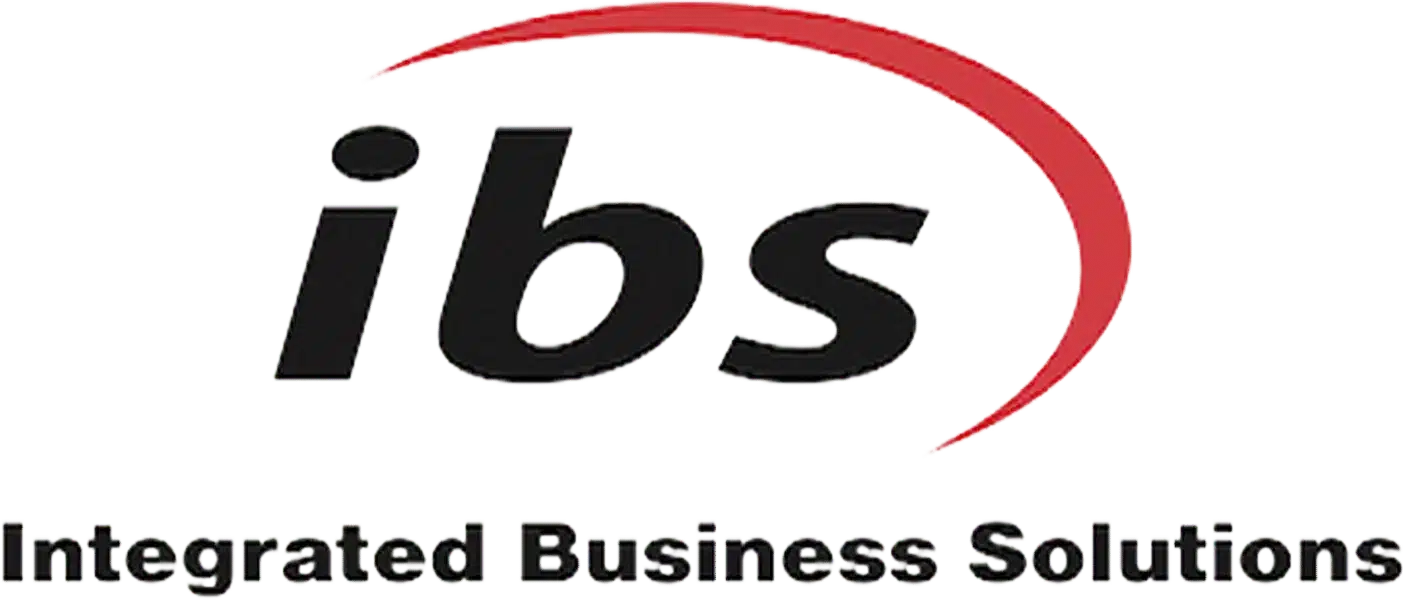
In the startup world, where competition is fierce and attention spans are fleeting, a memorable logo is a brand beacon. Integrated Business Solutions (IBS) exemplifies thoughtful logo design’s potential to encapsulate brand essence and drive success. For IBS, the logo was more than a design; it was a trust-building touchpoint for audience recognition.
IBS's initial, functional logo with complex graphics and overloaded design struggled to resonate. Recognizing misalignment with their mission of streamlined business solutions, they engaged designers to translate business concepts into visual narratives, a pivotal first step in reimagining their identity.
The new simple yet profound logo used bold, modern type exuding professionalism and confidence, paired with a streamlined graphic reflecting integration. This resonated with their demographic of entrepreneurs seeking reliable solutions. Deliberate colors conveyed trust, reliability, and innovation, aligning with IBS’s mission.
Post-launch, engagement soared. Formerly overlooked customers noticed the fresh, professional visual identity, boosting social media metrics. Existing customers experienced renewed loyalty, perceived through revitalized branding signaling quality and innovation commitment.
IBS’s case underscores a vital lesson: a logo is a critical brand touchpoint encapsulating mission, values, and promises. Understanding simplicity, relevance, and emotional resonance is crucial in creating memorable logos. By aligning design choices with brand identity, companies foster deeper audience connections, paving paths to lasting success. IBS’s logo stands as a testament to commitment to excellence and an invitation for new clients to embark on integrated business solutions journeys.
Need Help?
Check out these related products that can help:
