Logo Design
Exploring the Psychology Behind Effective Logo Design: What Makes a Logo Stand Out?
Dive into 'Exploring the Psychology Behind Effective Logo Design: What Makes a Logo Stand Out?' to uncover how colors, shapes, and simplicity shape memorable logos that resonate emotionally and enhance brand identity.
Dec 01, 2025
16 min read
Exploring the Psychology Behind Effective Logo Design: What Makes a Logo Stand Out?
The Logo Enigma: Decoding Visual Identity
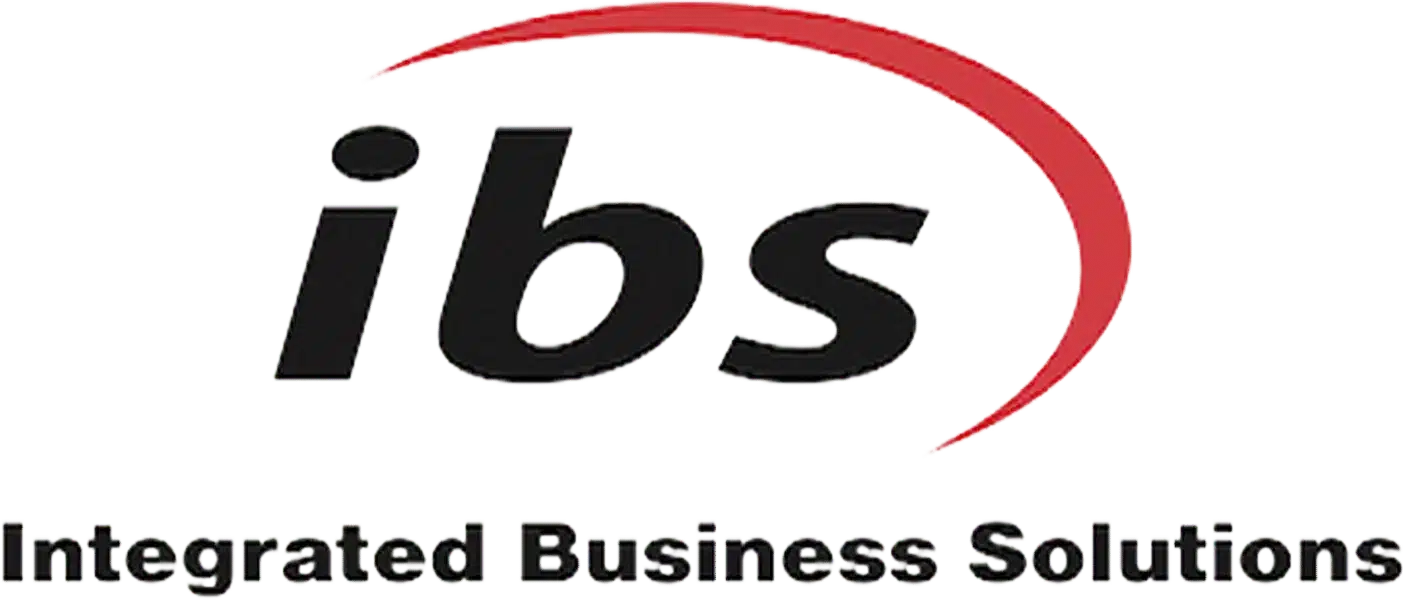
In the kaleidoscopic world of branding, logos are like a business’s fingerprints, distinctive marks that encapsulate the essence of an organization, often distilling its mission and values into a single, striking image. Take Integrated Business Solutions, for example. Their logo isn’t just a jumble of shapes and colors. It’s a meticulously crafted symbol of their commitment to innovation, reliability, and integration. When done right, a logo can tap into a deep well of emotions, influencing consumer perception and decision-making.
Our brains are impressively adept at processing simple visual stimuli. So, a minimalist logo, with its inherent simplicity, can cut through the chaos of modern advertising. Think about Nike's swoosh or McDonald's golden arches. Their simplicity is their superpower, acting as symbols that evoke entire lifestyles and emotions. Integrated Business Solutions could benefit from a similar approach, using only the essentials to communicate their brand ethos without overwhelming potential clients.
Yet, a logo's journey doesn't end at its design. In our digital age, a logo has to be a chameleon, adapting seamlessly across formats, from tiny app icons to towering billboards. This versatility ensures the brand essence remains strong, no matter the medium. For Integrated Business Solutions, their logo should be a shapeshifter, maintaining clarity whether it's in a boardroom presentation or on a social media feed.
Color psychology is another piece of the visual identity puzzle. Each hue has the magical ability to evoke specific emotions. A vibrant red stirs passion and urgency, while deep blues instill trust and stability, crucial in business services. For Integrated Business Solutions, choosing a palette that resonates with their audience can enhance brand recognition and foster emotional connections, nudging loyalty in their favor.
In the end, a logo is much more than a pretty picture. It’s the emblem of a brand’s journey, values, and promises. By understanding the psychology behind effective logo design, businesses like Integrated Business Solutions can craft identities that stand out and resonate deeply. These logos don’t just represent companies; they tell stories, inspire connections, and nurture loyalty, carving out a special space in the minds and hearts of consumers.
Color Psychology: The Art of Emotional Resonance
Color isn’t just a design choice; it’s a psychological weapon that forges emotional ties between a brand and its audience. In logo design, first impressions are pivotal, and color is the unsung hero, delivering messages, conjuring feelings, and subtly influencing behavior. Integrated Business Solutions can tap into this nuanced layer of color psychology to craft a logo that resonates emotionally and stands out in a crowded market.
Take red, for instance. A hue brimming with energy and urgency, perfect for brands that convey dynamism. Coca-Cola’s red logo doesn’t just satisfy an aesthetic preference; it’s an emotional rallying cry linked to joy and celebration. A glimpse of those red swirls whisks consumers to family gatherings or festive occasions, instinctively linking the drink to happiness.
On the cooler side of the spectrum, blue evokes trust, calm, and stability, a boon for industries needing reliability, like finance and healthcare. Banks often gravitate toward blue to signal tranquility and trustworthiness. For instance, Chase and American Express tap into a psychological foundation that encourages loyalty and a sense of safety, crucial for customer retention.
Beyond individual hues, color combinations play a powerful role. A palette blending blue and yellow can evoke trust and optimism simultaneously. Starbucks uses this technique effectively with its green logo, which signifies growth and renewal, juxtaposed against earthy brown accents that represent comfort and familiarity, a brand identity both welcoming and rejuvenating.
Colors evolve with cultural contexts and trends. A bright yellow might signal joy and accessibility in some cultures but could mean something else entirely elsewhere. Brands must be keenly aware of these cultural nuances when choosing their logo palettes to ensure they hit the mark globally without missteps.
So, the art of emotional resonance through color in logo design requires a blend of intuition, strategy, and research. For Integrated Business Solutions, exploring color psychology isn’t just about aesthetics; it’s a critical branding component that fosters recognition and emotional connection, transforming fleeting glances into lasting loyalty. In a competitive landscape, thoughtful use of color psychology will be key to crafting brand narratives that resonate on a deeper level.
Shape Matters: The Geometry of Trust and Recognition
Shapes in logos might often fly under the radar, yet they wield significant psychological power. The human brain loves shapes, readily digesting geometric simplicity over complex intricacies. This cognitive bias toward simplicity is rooted in our evolutionary instinct to quickly discern safety from danger. For a company like Integrated Business Solutions, harnessing this knowledge can be pivotal in effective branding.
Consider the world’s most recognizable logos: Starbucks' circular emblem, Nike's swoosh, or McDonald's golden arches. Their simple geometric forms evoke immediate recognition. Circles symbolize unity and trust, while sharp angles and squares convey strength and stability. A logo's shape subtly communicates a brand's essence, whether it’s the approachable nature of rounded designs or the professional vibe of angular ones. This is not purely aesthetic; it’s a strategic psychological choice.
The versatility of logo shapes in communication is paramount. Logos must be distinct and functional across a range of uses, from mobile app icons to billboards. A well-designed logo maintains its emotional impact and integrity, regardless of size. For Integrated Business Solutions, a logo that embodies reliability and efficiency should do so across all platforms and contexts.
Consider the impact of negative space. Clever use of negative space, like the hidden arrow in the FedEx logo, adds a secondary message that resonates with viewers, enhancing brand storytelling without complicating the visual experience. This clever use of geometry invites engagement beyond surface recognition, fostering a deeper connection.
In a world crammed with visual stimuli, shapes serve as beacons of familiarity and trust, guiding consumer memory and decision-making. A logo effectively utilizing shape not only stands out but builds a lasting relationship with its audience. For Integrated Business Solutions, leveraging these principles isn't just about creating a logo, it's about establishing a visual narrative that speaks volumes before a word is spoken.
Simplicity vs. Complexity: Striking the Perfect Balance
In logo design, the tug-of-war between simplicity and complexity isn't just aesthetic; it’s psychological, influencing how audiences perceive and remember brands. Our brains naturally favor simplicity, recognizing and processing simple patterns more efficiently than complex ones. This inclination stems from our evolutionary need for quick recognition of safety or danger. A logo embodying simplicity, clean lines, clear shapes, minimal colors, tends to lodge itself in memory.
Consider the Nike swoosh. Its elegance lies in its simplicity, a single curved line suggesting motion and speed. This no-fuss design lets it transcend language and culture, making it instantly recognizable. Meanwhile, logos that attempt to narrate complex stories can get muddled, risking forgettability or misunderstanding. Effective logo design distills a brand into its most elemental visual components.
Yet, simplicity doesn’t mean devoid of depth. Successful logos often layer simplicity with emotional resonance. Apple's logo, a stylized apple with a bite taken out, keeps it simple but symbolizes innovation and user-friendliness, appealing to a broad audience. So, while simplicity aids recall, symbolic depth elevates a logo’s impact.
Digital demands mean logos must adapt across sizes and platforms. A straightforward design retains integrity when scaled down for apps or social media. Conversely, intricate logos lose detail when shrunk, diluting brand identity. Adaptability supports a consistent brand presence.
Color also plays a crucial role. A simple logo can leverage color psychology to evoke emotions, a sunny yellow can radiate warmth, a cool blue can instill trust. The strategic use of color amplifies emotional connections.
Thus, balancing simplicity and complexity in logo design is more than a design challenge; it's a psychological endeavor. Integrated Business Solutions’ designers must navigate this landscape, crafting logos that are not only aesthetically pleasing but also communicate a brand’s core values and vision. The art of logo design lies in crafting a simple, yet rich emblem, an enduring representation of what a brand stands for.
Typographic Tactics: The Power of Font in Brand Messaging
In logo design, typography is the invisible force shaping consumer perceptions and emotions. Font choice goes beyond aesthetics; it’s a strategic decision that encapsulates a brand's ethos at a glance. For Integrated Business Solutions, font selection is deliberate, not incidental, embodying their core values.
Imagine passing a café with a playful, handwritten script logo. Its airy curls evoke warmth, creativity, and friendliness. Contrast that with a financial institution's stark, geometric sans-serif typeface, communicating stability and trust, essential in a sector where confidence sways consumer choices. This illustrates why typography is crucial in logo design.
Broadly, fonts fall into three categories: serif, sans-serif, and decorative. Serif fonts exude tradition and reliability, popular among brands showcasing history and trust. Sans-serif fonts scream modernity and simplicity, favored by tech startups suggesting innovation. Decorative fonts bring fun, creativity, or luxury, seen in brands like Coca-Cola or Disney.
Typography plays into emotional branding, a concept underscoring the importance of emotional connections with customers. High-end fashion labels use elongated serif fonts, evoking exclusivity and sophistication. In contrast, tech startups might select rounded sans-serif fonts for an approachable, open vibe.
Letter weight and spacing add nuance. A dense, compressed font may signal urgency, while open, spaced letters induce calm. Typography can guide behavior; tight kerning might suggest authority, nudging consumers to trust the brand.
In a digital-first market where Integrated Business Solutions competes, impactful typography is indispensable. Every letter and curve contributes to a larger narrative, shaping how a brand is perceived. Thoughtful typographic elements carve out a distinctive identity, evoking desired emotions and fostering loyalty. Amidst visual stimuli, typography makes a logo memorable and impactful.
Cultural Relevance
In our interconnected world, cultural relevance in logo design is paramount. Logos aren't just visuals; they’re cultural artifacts, encapsulating a brand’s ethos while resonating with diverse audiences. Integrated Business Solutions knows that capturing cultural relevance is essential for creating logos that bridge global divides.
Consider a major coffee chain’s logo, a green siren, symbolizing nature and tranquility, appealing to eco-conscious consumers. The green isn’t random; it signifies growth, resonating with consumers prioritizing sustainability. This resonance helps tailor messaging and create belonging among diverse demographics.
Cultural relevance is beyond colors; it includes symbols, shapes, and typography. In some Asian cultures, red signifies good fortune. A company targeting that market might tweak its logo to include red, aligning identity with local customs. This is how cultural nuances shape design, creating logos that aren’t just visually appealing but meaningful.
Logos must evolve with societal changes to stay relevant. Consider a tech giant's logo evolution, adapting to minimalism trends while retaining identity. This adaptability keeps logos fresh and engaging, emphasizing cultural awareness.
Creating culturally resonant logos requires collaboration, incorporating feedback from diverse backgrounds. Integrated Business Solutions prioritizes inclusivity, gathering insights from stakeholders and consumers. This ensures the logo reflects a collective identity, not a singular viewpoint.
Ultimately, a logo’s success hinges on navigating cultural relevance. It must convey the brand message and align with the values of those it serves. Achieving this balance transforms a logo into a trust, belonging, and emotional connection symbol. In a global landscape, companies harnessing cultural relevance in their logo design cultivate lasting relationships, ensuring they stand out in a crowded market.
The Evolution of Logos: A Journey Through Time
The journey of logo design is as intricate as branding's evolution itself. At its core, a logo serves as a visual identifier, encapsulating a company's mission, values, and personality in a singular image. Modern logo design roots trace back to ancient civilizations, where symbols represented clans, cities, and deities. Fast forward to the Renaissance, where intricate emblems adorned books and family crests, laying early branding foundations.
In the industrial age, logos evolved from ornate designs to simpler forms, reflecting mass production and advertising's significance. Coca-Cola and Ford’s logos became synonymous with products and the broader American experience. The golden ratio and grid systems introduced allowed aesthetically pleasing and strategically impactful logos. Coca-Cola's iconic script remains timeless for its fluidity and charisma, evoking nostalgia.
The digital age marked another significant logo evolution. Brands needed logos that weren’t just beautiful but versatile across platforms. As pixelation and resolutions rose, scalable logos were vital, a concept tech companies embraced. The Apple logo, a sleek apple silhouette, demonstrates this mastery, seamlessly appearing on smartphones, laptops, and billboards.
The 21st century ushered in minimalism, where less truly became more. Brands stripped superfluous details, focusing on shape and color psychology to evoke emotions. Airbnb and Uber pioneered this shift, using simple imagery to communicate trust and innovation. These logos resonate deeply, instilling familiarity and reliability that fosters loyalty. In social media's age, memorable logos are vital, eye-catching and meaningful, conveying a brand’s ethos instantly.
Logo evolution is linked to societal shifts and cultural movements. Consider eco-friendly logo trends, aligning with sustainability consciousness. Starbucks updated its green emblem to feel more organic, reflecting these values.
In design evolution's dynamic tapestry, logos aren't static images; they're living entities reflecting societal, technological, and consumer expectation changes. Integrated Business Solutions aims to explore this journey deeply, applying it thoughtfully in brand representation quests.
The Impact of Storytelling: Logos as Brand Narrators
Logos serve as silent narrators in brand tales, encapsulating complex stories about values, missions, and personalities into simple visuals. The essence of storytelling in logo design lies in its ability to communicate a brand's identity and ethos instantly. Imagine walking through a bustling city; bombarded with logos, some linger in your mind long after. This is the power of a well-crafted logo, narrating a story without words.
The brain loves narratives, processing visual storytelling easily. A logo can encapsulate meaning: a letter's curve suggests friendliness, a sharp edge professionalism. Take Nike’s swoosh, a single, fluid shape represents motion and speed, telling a perseverance story and inviting emotional connection.
Visual elements like color, shape, and typography are storytelling tools. Blue, linked to trust, appears in financial logos. Here, blue conveys security, inviting consumer engagement. Rounded shapes in fast-food logos evoke warmth and approachability.
Logos' emotional resonance impacts behavior. When consumers connect with a logo embodying their values, purchasing decisions align with emotional bonds. Starbucks’ green represents coffee, sustainability, and community, telling a sourcing and ethical practices story.
The storytelling capacity of logos goes beyond aesthetics; it’s vital to identity. A successful logo distills a brand's essence into a memorable image that sparks joy, nostalgia, trust, or excitement. Integrated Business Solutions understands their logo isn’t just design but a narrative vehicle encapsulating mission, speaking to emotions. Logos create enduring consumer connections by embracing storytelling's psychological underpinnings, ensuring brand narratives are seen and felt.
Future Trends: The Next Generation of Logo Design
As we gaze into logo design’s future, we stand at technology, creativity, and psychology's convergence. In an era where digital presence defines identity, logos adapt to dynamic consumer expectations. Audiences today demand authenticity, depth, and emotional resonance, pushing designers into uncharted territories. This shift heralds the next logo design generation, where minimalism meets storytelling, and interactivity shapes user experience.
A prominent trend is adaptive logos. Unlike static designs, adaptive logos change appearance based on context. Airbnb uses frame differentiation, altering its logo for platforms from apps to ads. This flexibility fosters recognition and maintains relevance across media landscapes, ensuring logos remain impactful regardless of size or format. More businesses will embrace this, making responsive logos a branding strategy cornerstone.
Augmented reality (AR) and virtual reality (VR) integration presents a fascinating frontier. Picture a logo coming to life with a mobile scan, revealing a brand’s story, values, or interactive elements for deeper engagement. This innovation lets logos transcend traditional boundaries, becoming dynamic gateways connecting brands to audiences. Coca-Cola's AR experiences invite consumers to engage with brand narratives directly.
Color psychology still plays a key role in logo perception, but the future demands a nuanced understanding of color dynamics in cultural contexts. Global markets' interconnection means designers must embrace an inclusive approach considering diverse color associations. Red may signal excitement in the West but prosperity elsewhere. Cross-cultural sensitivity enhances logo resonance, positioning brands for deeper global audience connections.
Sustainability and ethical branding will increasingly inform logo design. Brands like Patagonia and The Body Shop integrate eco-friendliness into identities, using earthy tones and organic shapes for responsibility and care. Future consumers will seek brands reflecting their values, pushing designers to create logos conveying sustainability, authenticity, and social consciousness narratives.
Storytelling remains crucial in logo evolution. Future logos must encapsulate missions and visions, conveying stories through simple visuals. A well-crafted logo isn’t merely graphic but a symbol evoking emotion and inviting connection, like Nike’s swoosh or Apple’s apple, cultural icons transcending simplicity.
The next logo design generation embraces technological advancements while grounding in psychological principles and cultural sensitivity. As consumer behavior shifts, designers must be nimble, innovative, and attuned to the society served. Future logos aren’t just about aesthetics; they create meaningful relationships, drive engagement, and resonate emotionally across generations. The challenge is designing logos that inspire loyalty and spark conversations.
Brand Strategies in Action
In logo design, Integrated Business Solutions (IBS) distinguishes itself not just through innovation but a keen understanding of logo psychology. In a world where logos are omnipresent, on coffee cups, street signs, and screens, IBS uses these symbols as powerful tools evoking emotions, forging connections, and influencing behavior. Their approach is a masterclass in design psychology, showing how a thoughtful logo encapsulates values and missions.
Take how IBS uses clean lines and a minimalist aesthetic in its logo design. This philosophy aligns with simplicity enhancing memorability. Amidst visual noise, a straightforward logo enables quick recognition, ensuring the brand lingers in potential customers' minds. IBS’s logo embodies this principle, using only essentials to convey its message, speaking volumes about commitment to clarity and efficiency. This clean approach reflects the brand essence and caters to an audience valuing straightforwardness in complexity.
IBS considers logo adaptability across mediums and sizes, crucial in a digital-first landscape. As consumers interact on platforms from smartphones to billboards, IBS ensures logo recognizability and legibility. This adaptability supports brand continuity and enhances user experience, reinforcing trust and reliability IBS projects.
Color psychology is a significant branding strategy aspect. IBS chooses a palette evoking trust and innovation, leveraging hues resonating with its demographic. Incorporating blues communicates professionalism and dependability, paramount in business services. This strategic color use influences perception and aligns with emotional triggers increasing engagement and loyalty.
In essence, Integrated Business Solutions demonstrates a successful logo is beyond design; it’s an emotional statement encapsulating a brand. By applying logo design psychology principles, IBS crafts a standout visual identity and builds robust customer connections. This interplay between design and psychology reveals logos' potential to create lasting impressions and drive loyalty, lessons invaluable for businesses thriving in competitive markets. In a world where first impressions matter, IBS exemplifies how a well-conceived logo serves as a formidable ambassador for brand values and ambitions.
TL;DR
Logos are more than just visual identifiers; they're deeply rooted psychological tools that influence consumer perception and behavior. Integrated
Need Help?
Check out these related products that can help:
Other Articles You Will Like

Logo Design
7 Essential Tips for Creating a Memorable Logo Design
Unlock the secrets to impactful branding with these 7 essential tips for creating a memorable logo design. Discover how simplicity, color psychology, and strategic symbolism can elevate your brand identity and resonate with your audience.
Dec 01, 2025
Read More
Logo Design
Logo Design Trends for 2025: What’s Hot and What’s Not?
Dive into the vibrant world of logo design trends for 2025! Discover how AI, sustainability, and nostalgia are shaping the future of branding. From bold colors to dynamic logos, learn what’s hot and what’s not in this exciting landscape.
Nov 30, 2025
Read More
Logo Design
Brand Identity and Logo Design: How They Work Together in 2025
Discover how brand identity and logo design intertwine in 2025, creating compelling narratives that resonate with consumers. Learn from Integrated Business Solutions' innovative approach to branding and design.
Nov 30, 2025
Read More
Logo Design
10 Essential Tips for Designing a Memorable Logo in 2025
Unlock the secrets to effective logo design with our 10 essential tips for 2025. Learn how to blend tradition with modern trends, simplify your design, and create a memorable brand identity that resonates across cultures.
Nov 29, 2025
Read More